
Luxury Hotel Brand Comparison: Claridge’s vs The London EDITION
A luxury hotel brand comparison might not seem relevant to your wedding business at first glance.
But the difference between wedding businesses booking £20k–£500k clients and those stuck competing on price usually comes down to one thing:
👉 brand positioning so it’s essential that you TRULY understand it.
In this article, we’re breaking down:
• how Claridge's positions itself
• how The London EDITION positions itself
• why both succeed despite being completely different
• and how to apply this to your wedding business
What is luxury brand positioning?
Luxury brand positioning is the process of defining a clear, distinctive identity that attracts a specific type of high-value client through consistent messaging, visuals, and experience. It’s all about dominating a specific segment of the market so that you stand out from your competitors and give your ideal client a reason to book you and, most importantly, pay a premium for you.
Same Market, Different Luxury Strategy
Claridge’s and The London EDITION operate in the same city.
They attract:
• affluent clients
• international travellers
• experience-led buyers
Yet their branding is entirely different. I am going to break down the differences so you understand how service based brands do this to stand out in an overly satuarted market.
First Visual Impression (Website Design Analysis)
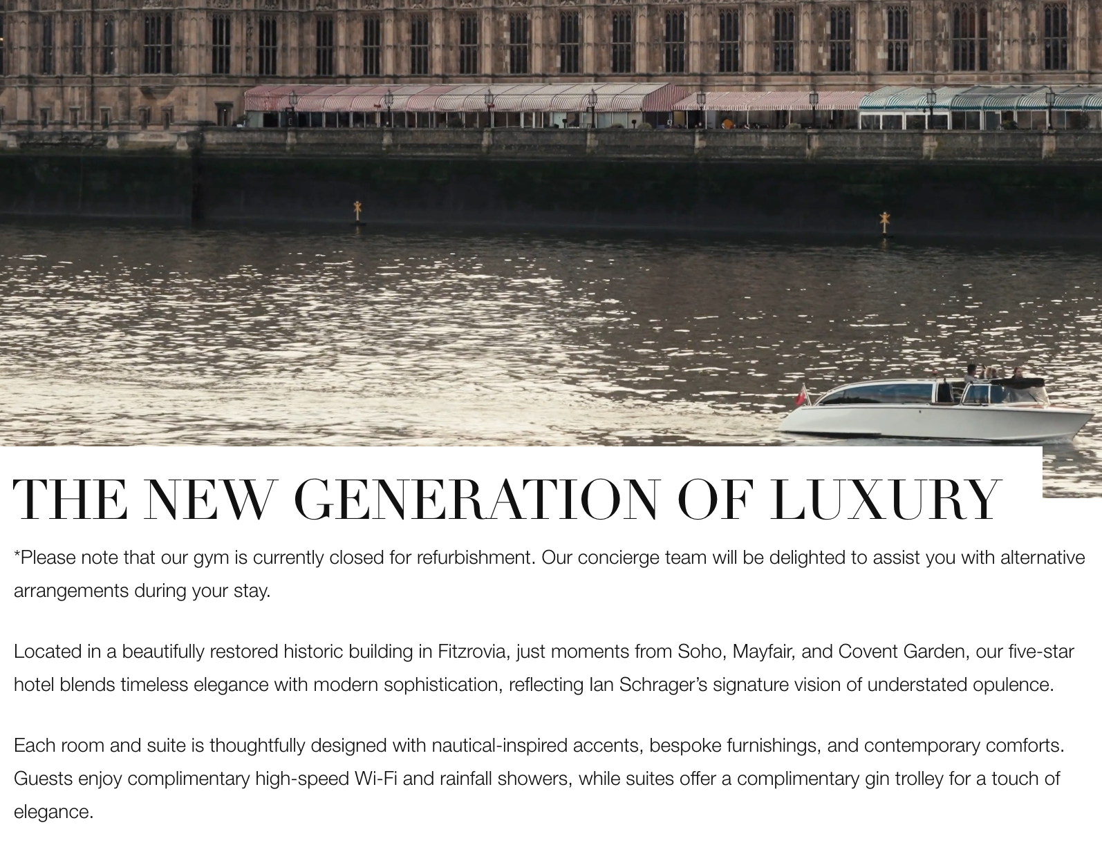
The London EDITION Website: Editorial Luxury
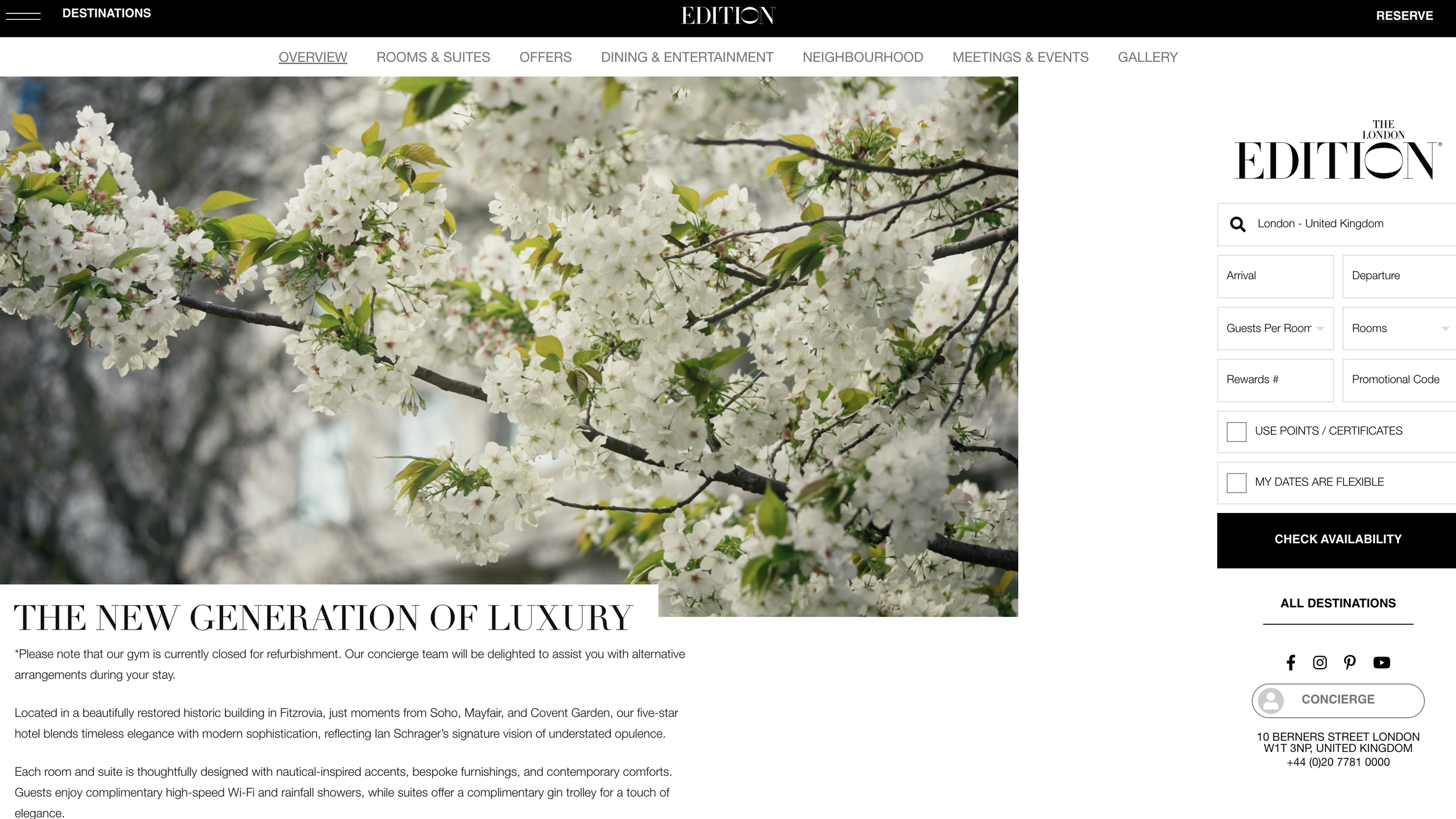
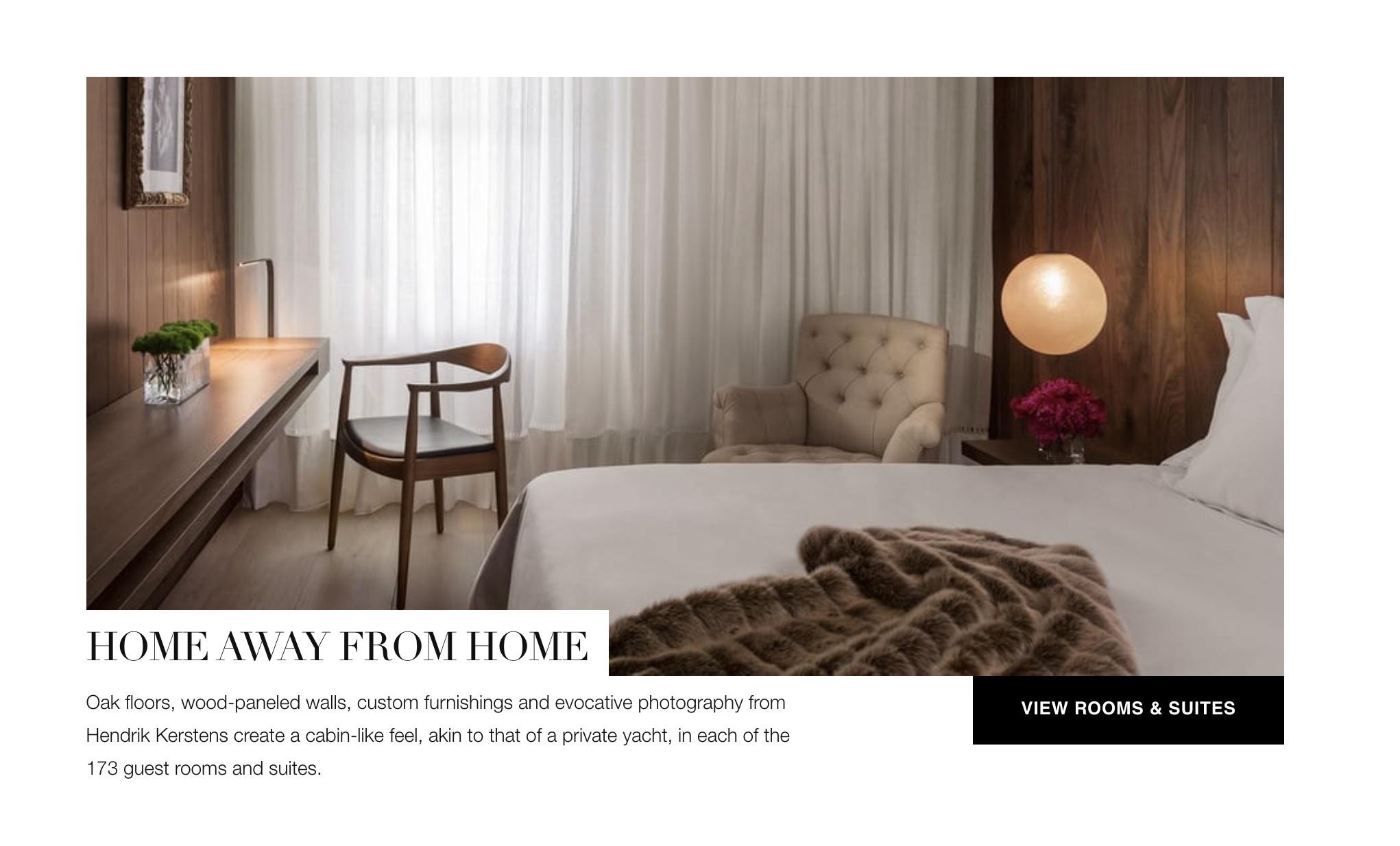
The London EDITION’s website does not feel like a hotel website.
It feels like a magazine.
Why It Feels Like a Magazine
Design Characteristics:
Editorial feature-style writing
Full-bleed imagery
Minimal text overlays
Strong typographic hierarchy
High use of negative space
Brand Signal Created
👉 curated
👉 cultural
👉 contemporary
The London EDITION uses editorial design principles to position itself as a culturally relevant, modern luxury brand rather than a traditional hotel.
Even the name reinforces it.
The name “EDITION” comes from editorial culture.
Magazines. Features. Curated issues.
Claridge’s Website: Timeless Luxury
Claridge’s creates the opposite feeling.
Before reading a single word, you already understand the brand.
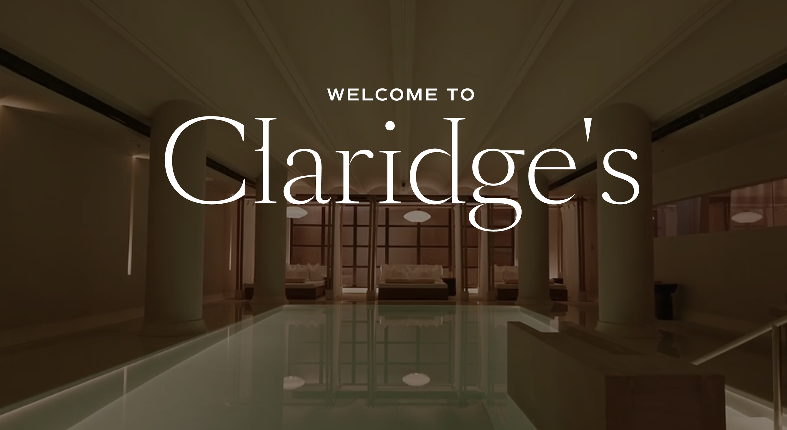
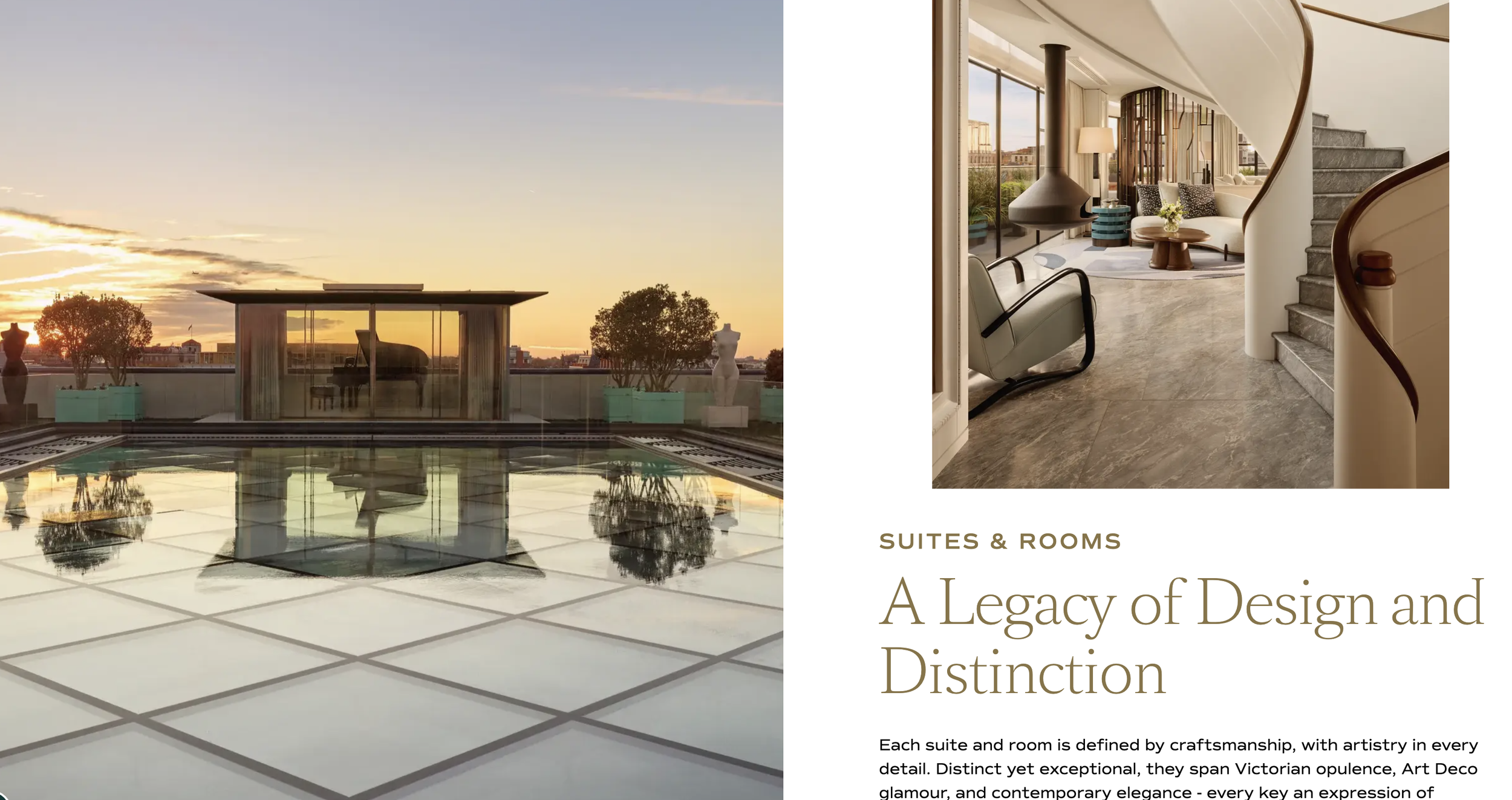
Why It Feels Timeless
Here’s why your brain reads it that way:
👉 Serif typography
These are the fonts used in newspapers, books, and historic institutions. Your brain associates them with authority and tradition.
👉 Gold + neutral tones
Gold signals wealth, but in a quiet way. The gold is muted. Almost beige.
Not flashy → established wealth, not new money.
👉 Structured, symmetrical layout
Nothing feels experimental or ‘trendy’.
Everything feels considered and balanced (even the photos are perfectly balanced with Squares. Straight lines. Clean structure. No curves, no quirky shapes, no “design trends”)
Brand Signal Created
👉 heritage
👉 trust
👉 longevity
Claridge’s uses traditional design cues to signal heritage, authority, and long-standing luxury credibility.
Now look at the first thing each luxury brand says

The London EDITION immediately makes it clear:
They are not “old luxury”.
They’re speaking to a new generation who want something more modern, more cultural, more current.
They’re positioning themselves against legacy hotels.
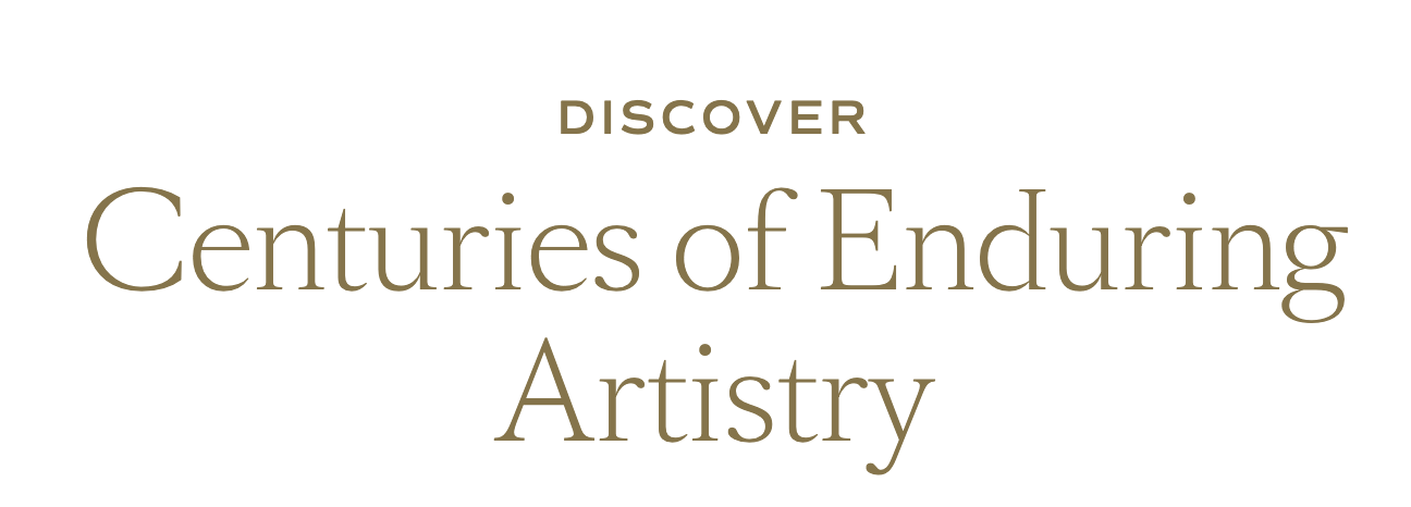
Claridge’s does the opposite.
They lead straight with time.
Centuries. Legacy. History.
They’re saying: “We’ve been the standard for generations. We know luxury.”
| Element | Claridge’s | The London EDITION |
|---|---|---|
| Core Position | Heritage luxury | Modern luxury |
| Emotional Trigger | Trust & legacy | Identity & culture |
| Visual Style | Classic, structured | Editorial, minimal |
And notice the supporting language to support their brand’s luxury position
The London EDITION supports their positioning with:
👉 contemporary comforts
👉 New York references
👉 cultural name drops
They’re building a world that feels:
Modern
Editorial
Globally influenced
Now let’s look at Claridge’s supporting language
Claridge’s supporting language all points in one direction:
👉 “shaped by centuries of enduring artistry”
👉 “a legacy of design and distinction”
👉 “more than two hundred years…”
They’re building a world that feels:
Classic
Timeless
Quietly assured
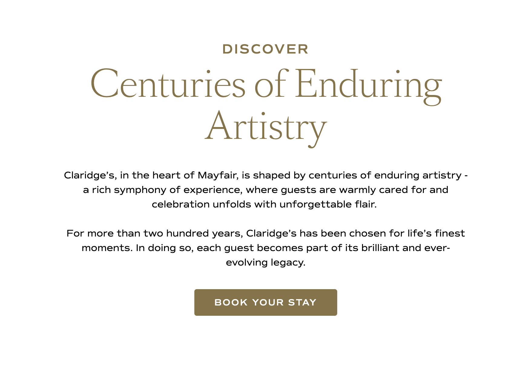
Claridge’s maintains a singular brand narrative, reinforcing heritage and longevity across all messaging.
How their Instagram ties into the brand strategy
Your Instagram should ALWAYS align with your brand position, so let’s take a look at how these two brands do it.
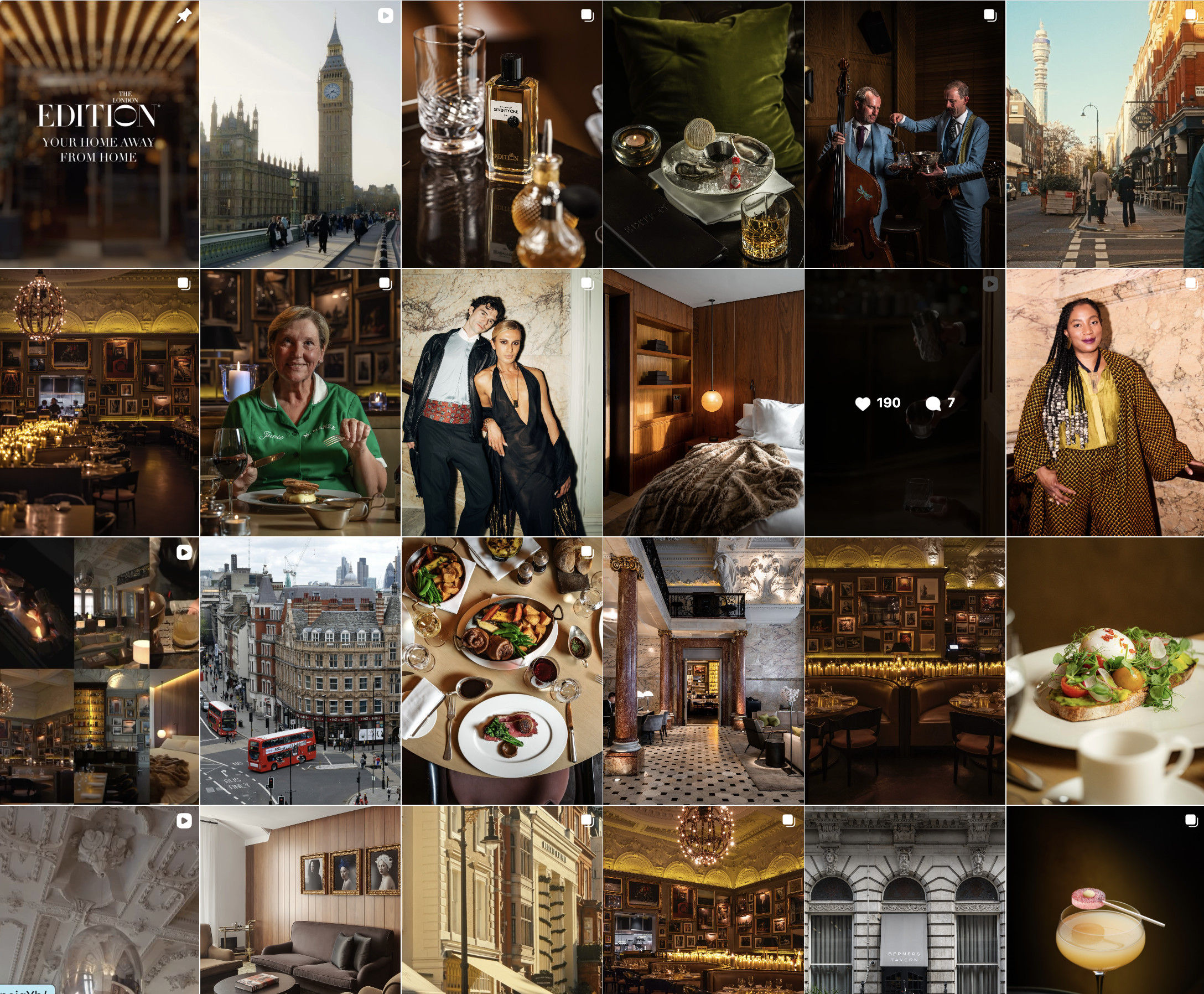
The London EDITION
• darker colour grading
• lots of shadows
• close-up, styled shots (drinks, textures, details)
• more “scene” energy (music, nightlife, culture)
👉 This creates:
editorial, curated, slightly exclusive feel and directly mirros their website’s position:
• a magazine spread
• a members club
• somewhere you’re seen
👉 “I’m part of culture”
👉 Their ideal client values image, aesthetic, scene
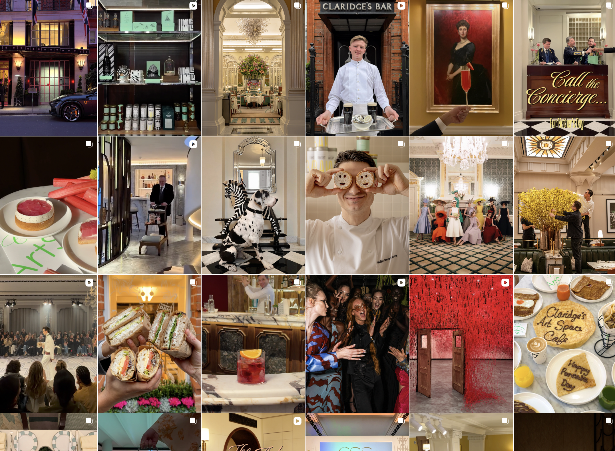
And now let’s look at Claridges. Their Instagram is classic luxury but very ‘fun’
Claridge’s isn’t just saying: 👉 “we are historic”
They’re saying: 👉 “we are historic… but still culturally relevant”
With posts such as.....
• formal concierge… with theatrical typography
• historic portrait… styled with a modern drink
• heritage interiors… paired with bold fashion
This directly reflects their website positioning:
👉 heritage
👉 timeless
👉 established
Their audience says:
👉 “I have taste, but I don’t need to prove it”
👉 enjoys experience, personality, tradition
Claridge’s uses contrast between tradition and modern elements to maintain cultural relevance while reinforcing heritage positioning.
What This Means for Wedding Businesses
Most wedding businesses say:
👉 “I want to be luxury”
But they never define:
👉 what kind of luxury
The Core Problem
Trying to be everything to everyone because you are so scared of alienating yourself, or not looking and sounding ‘luxury’ so you try to sound:
• timeless
• modern
• editorial
• classic
All at once.
Result
👉 no clear identity
👉 no emotional connection
👉 weak conversion
You sound and look like everyone else and so there is no reason to pay a premium for you or pick you over your competitors.
What Luxury Actually Is
Luxury branding is the process of creating a distinct, high-value identity that aligns with a specific type of client and is consistently communicated across all touchpoints.
Key Principles
Clarity over what position you OWN in the market
Consistency to reinforce that position in the market
Identity over conformity
The Real Buyer Psychology
Luxury clients are not just buying a service.
They are buying:
👉 identity - who they want the world to perceive them as.
👉 alignment - the brands that align with the person they aspire to be.
👉 self-perception - who they think they are.
Example
• Claridge’s client → values legacy, classic luxury, all whilst having fun
• EDITION client → values culture, modernity, being seen as ‘cool’ and in the know.
Claridge’s and The London EDITION prove that:
👉 luxury is not one aesthetic
👉 luxury is not one strategy
👉 luxury is not about fitting in
Luxury brands win by:
👉 choosing a position
👉 committing to it
👉 expressing it consistently
If you want to position your brand properly and attract high-spending couples, I work with wedding professionals to refine their brand, messaging, and sales strategy so they become the obvious choice.
Click here to book a discovery call with me and let’s discuss your brand and marketing strategy to attract and book high-spend couples.
What is luxury brand positioning in weddings?
Luxury brand positioning is defining a clear position in the market and identity that attracts high-spending couples who align with the position you are dominating. You do this through consistent messaging, design, and client experience. If you’re struggling with this, this is exactly what I help my clients refine inside my coaching programme.
Why am I not booking high-end wedding clients?
Because your brand likely lacks clear positioning, strong messaging, and a premium enquiry process.
What makes a wedding brand feel luxury?
Clarity on your brand identity, consistency in your market position, high-end design, and a structured client experience.
Is luxury branding just about visuals?
No. Visuals support the brand, but positioning and messaging drive perception.